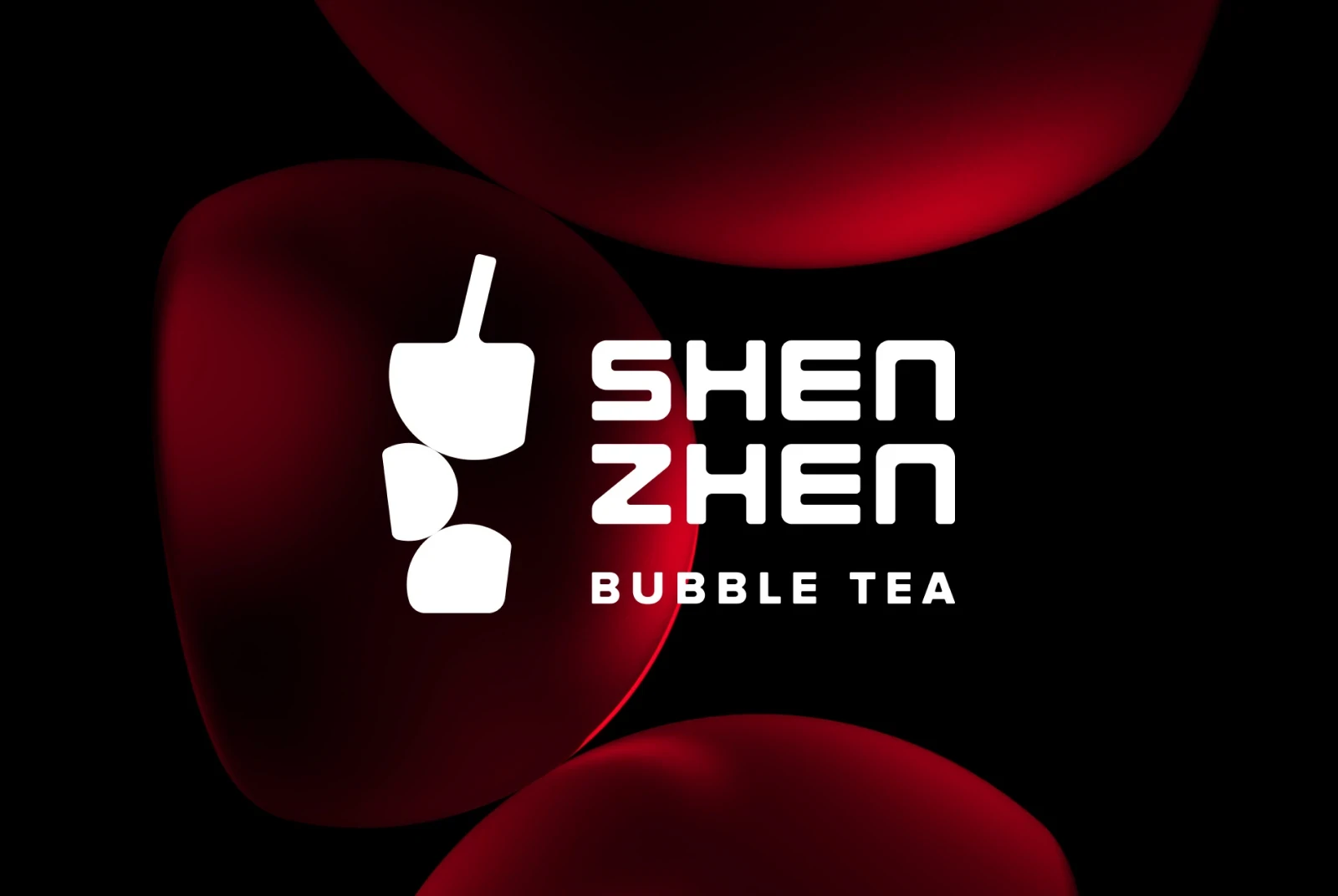
The Brief
Bubble tea is a popular Taiwanese drink made with tea, milk and chewy tapioca pearls. Served hot or cold, it’s enjoyed for its distinct combination of textures and customizable flavors. Shenzhen, a high-end bubble tea brand, aims to establish a unique brand identity to stand out from competitors as it prepares to open its cafe in New York.
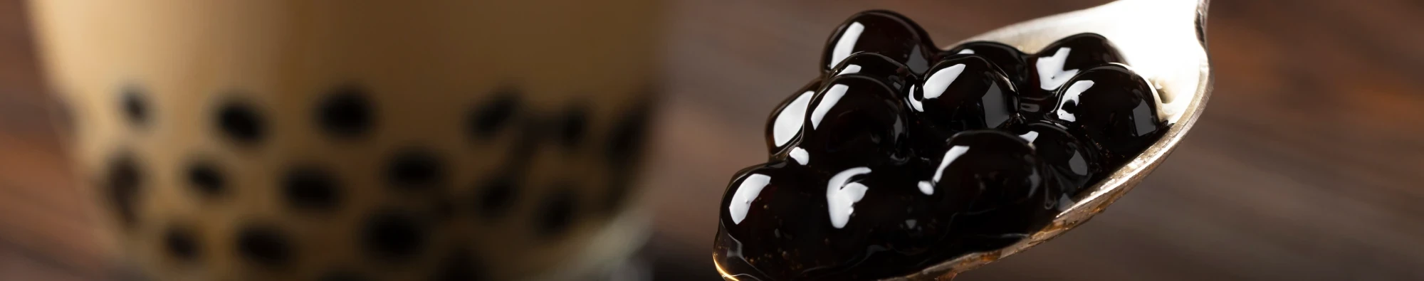
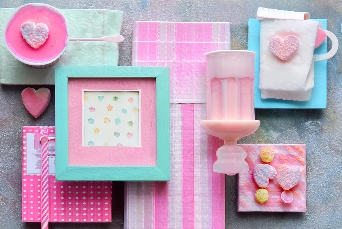
The Challenge
When analyzing the competing brands near the planned café location, it was observed that most of them favored pastel color schemes and occasionally featured cute mascots. Additionally, most logos relied heavily on direct representations of bubble tea imagery, with minimal creative interpretation.

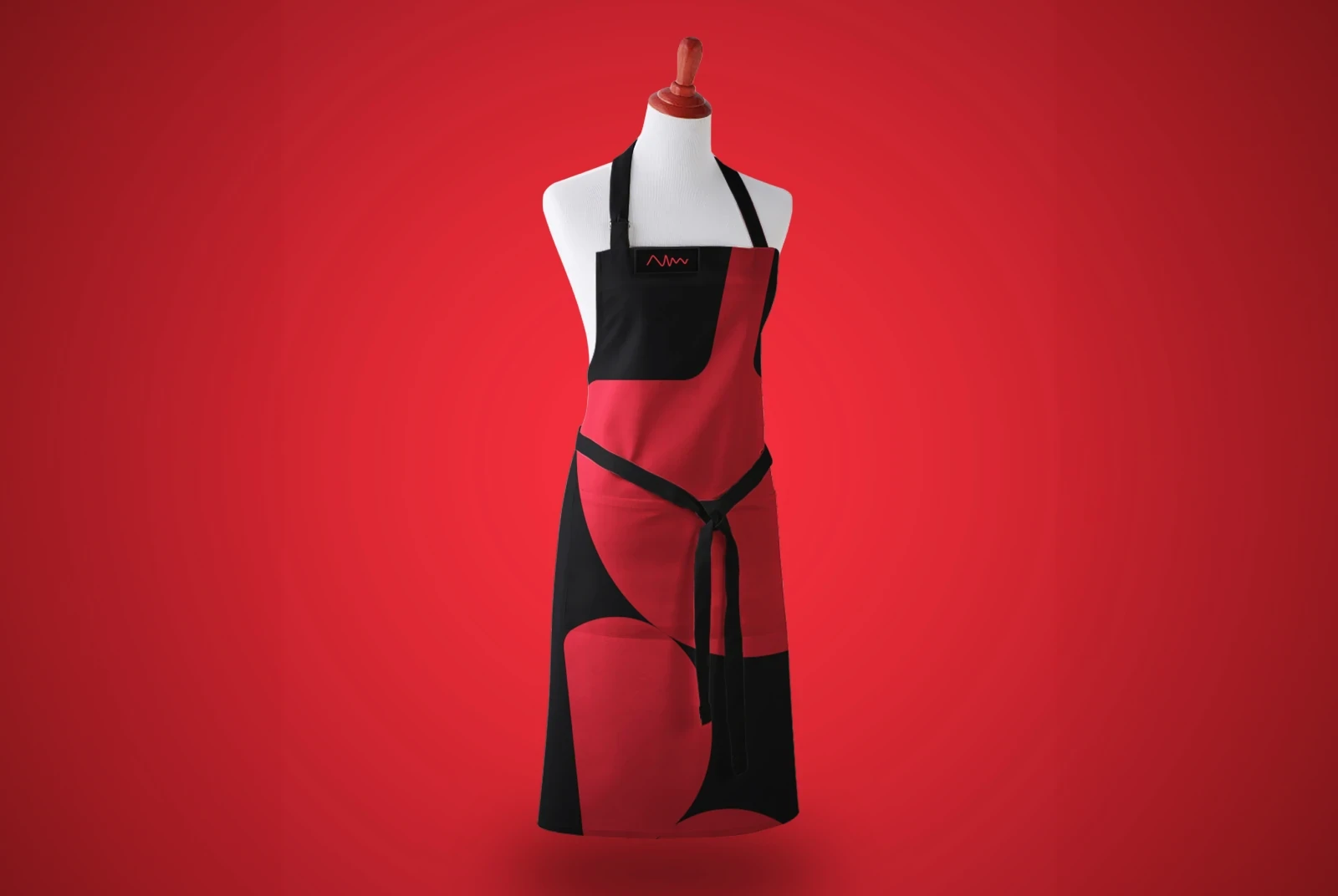
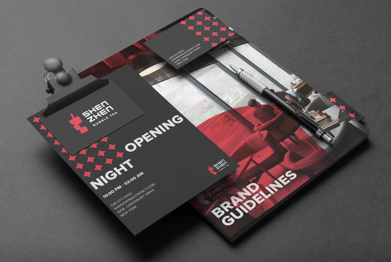
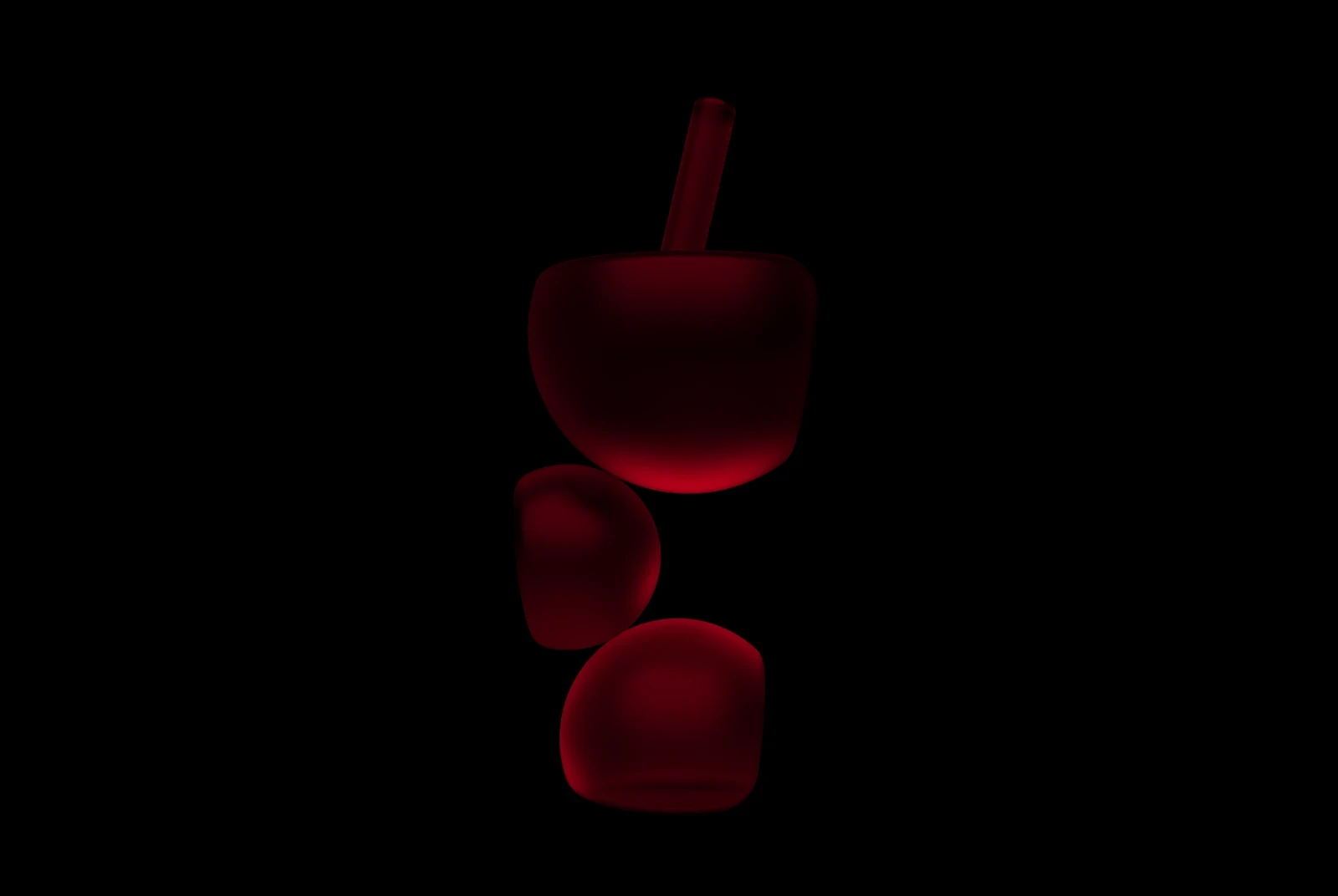
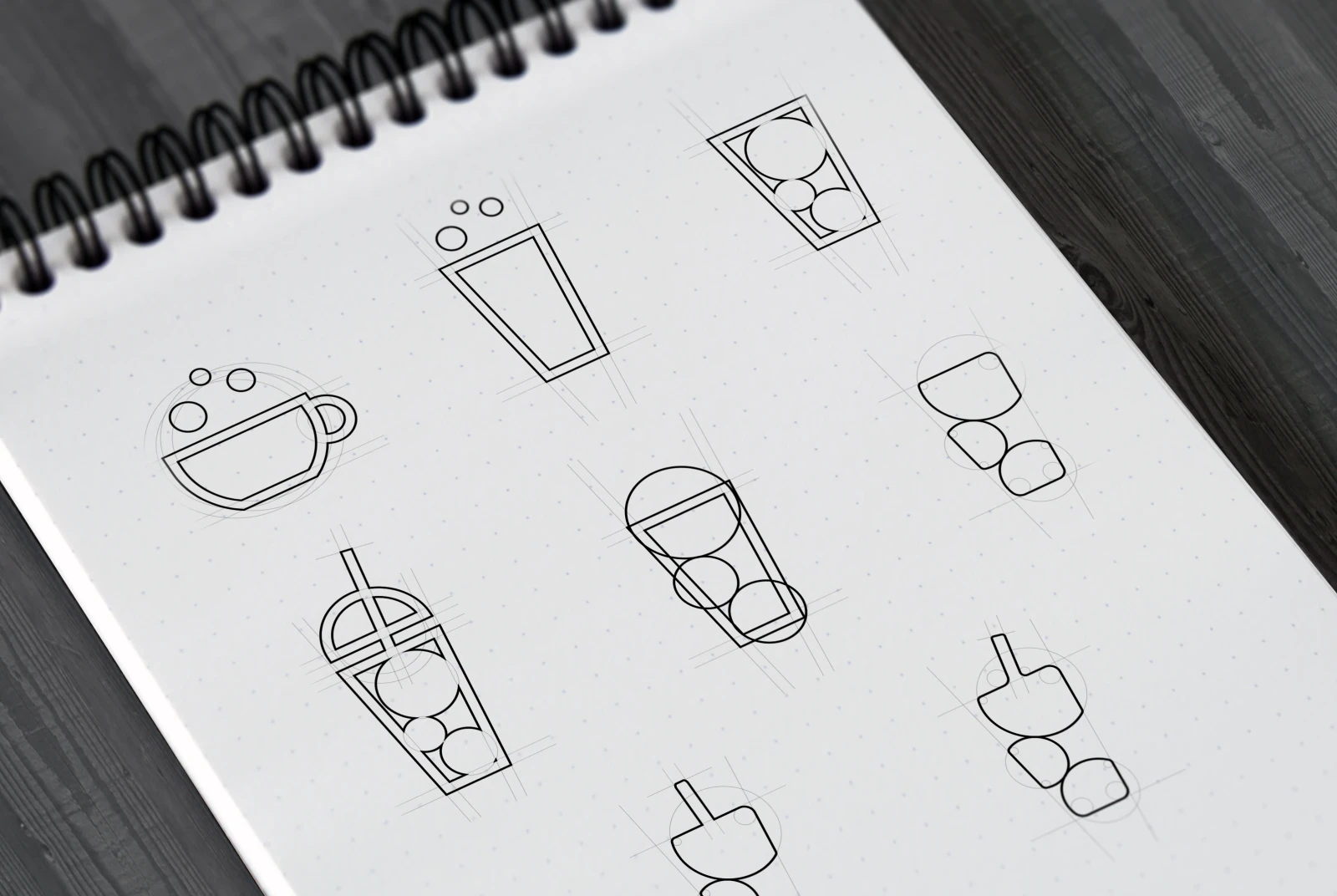
The Solution
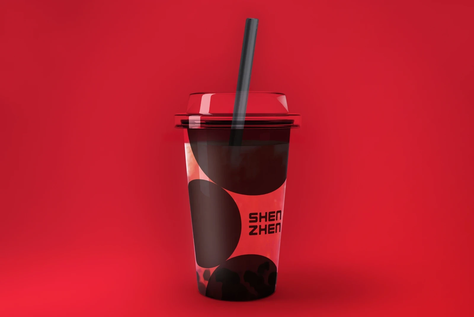
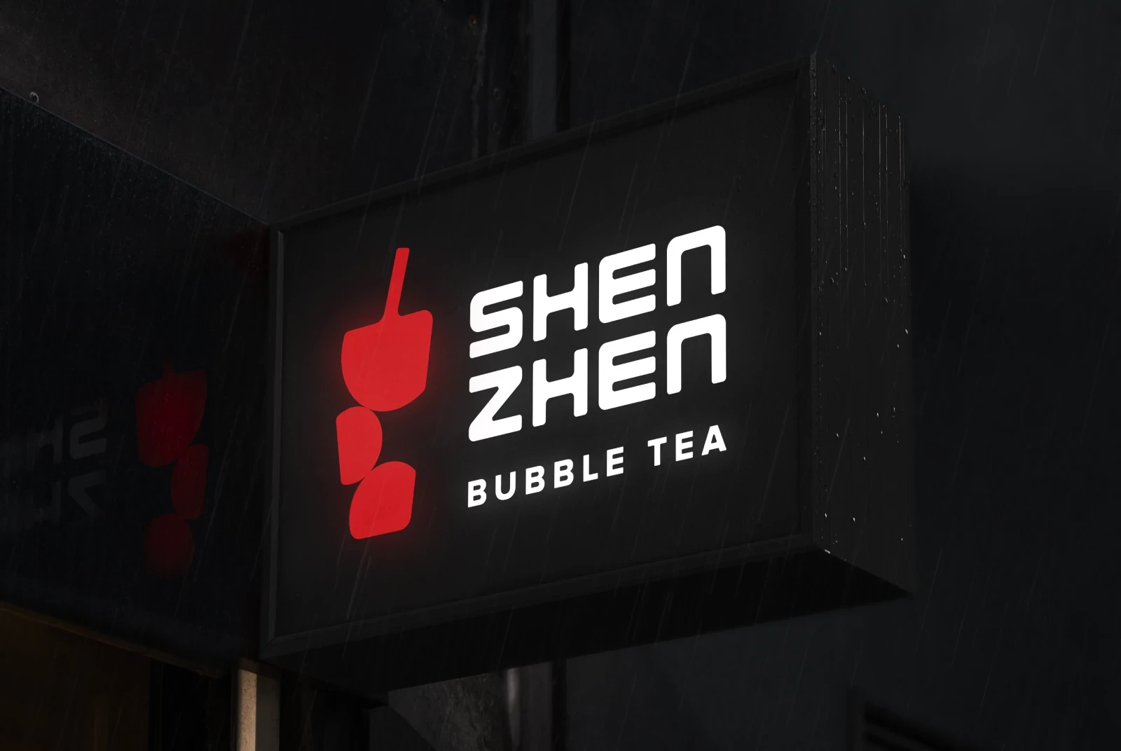
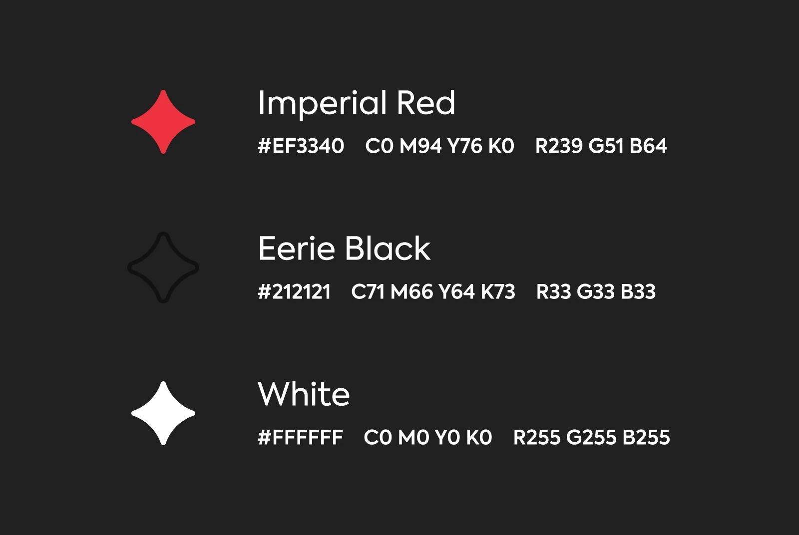
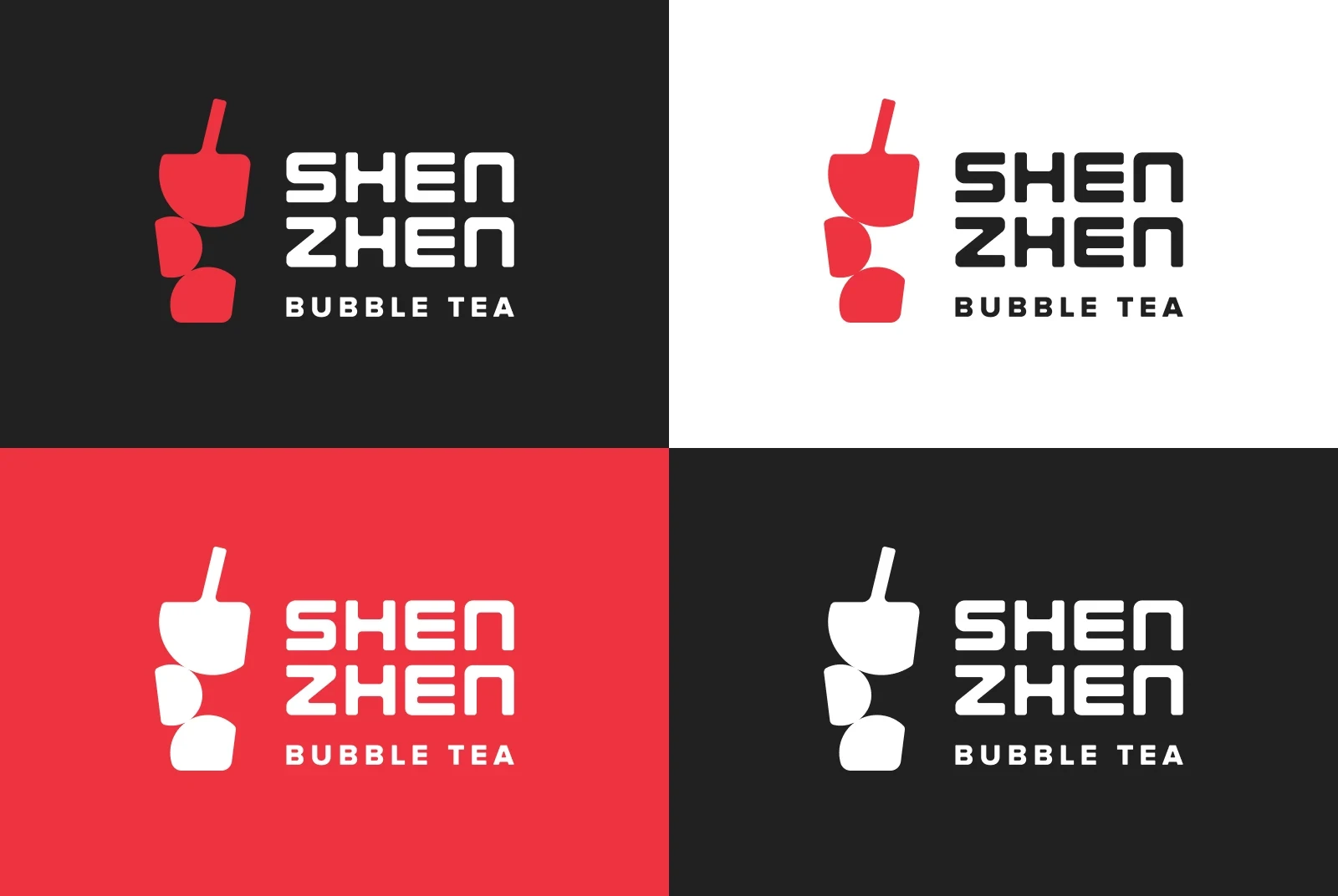
To set the brand apart from its competitors, the bubble tea imagery was reimagined by shifting the focus from tapioca pearls to a drink filled with bubbles. This simplified logo design not only enhanced adaptability but also made the brand more distinctive compared to others in the market.
Conclusion
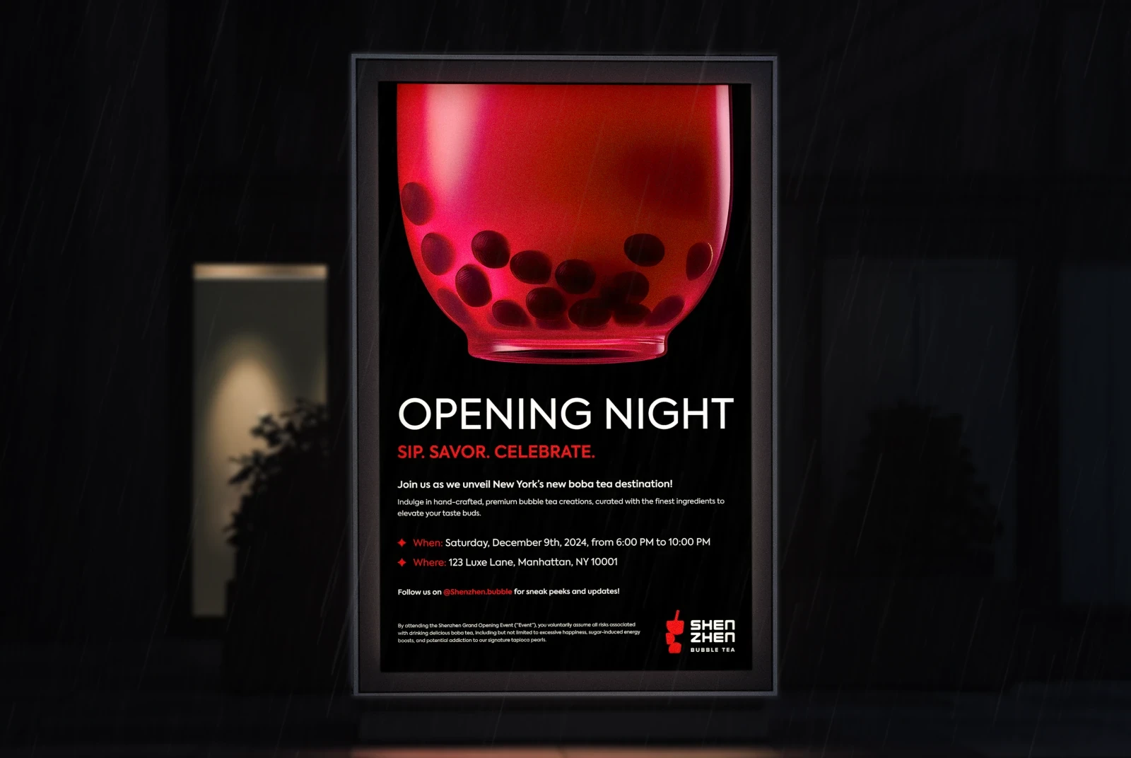
Originally created as part of a 30-day logo design challenge, this concept project was later refined and expanded in scope. When submitted to the r/logodesign subreddit on Reddit, it received over 2,000 upvotes, becoming one of the top posts in the community.
The Brief
Bubble tea is a popular Taiwanese drink made with tea, milk and chewy tapioca pearls. Served hot or cold, it’s enjoyed for its distinct combination of textures and customizable flavors. Shenzhen, a high-end bubble tea brand, aims to establish a unique brand identity to stand out from competitors as it prepares to open its cafe in New York.
The Challenge
When analyzing the competing brands near the planned café location, it was observed that most of them favored pastel color schemes and occasionally featured cute mascots. Additionally, most logos relied heavily on direct representations of bubble tea imagery, with minimal creative interpretation.
The Solution
To set the brand apart from its competitors, the bubble tea imagery was reimagined by shifting the focus from tapioca pearls to a drink filled with bubbles. This simplified logo design not only enhanced adaptability but also made the brand more distinctive compared to others in the market.
Conclusion
Originally created as part of a 30-day logo design challenge, this concept project was later refined and expanded in scope. When submitted to the r/logodesign subreddit on Reddit, it received over 2,000 upvotes, becoming one of the top posts in the community.